Data Visualization Tips

This is a first article from the set about our work with Tableau and visualization. We’ll talk about some useful data visualization tips we’ve discovered, and shed light on the software advantages and disadvantages.
Let’s do it, to it! So, what is visualization? We can describe it in two ways. First, it is software that we use to create a picture. And the second, is how we create the design and the visual architecture to attract the eye or convey meaning.
Before you start to build visualization, or charts, you need to answer two questions. The first is, “What is my goal?” or “What do I want to show through it?”
For example, I make some assumption, or I solve the problem and draw conclusions. Either I want to evoke some kind of emotion, or I want to induce one to commit a particular action.
And the second question is your audience. Who are these people? What do you know about them? For example. How technically savvy are they? How much do they know the domain? Perhaps this is completely new information for them? Answering these questions, we can create a story and bring it through visualization.
So, we have collected a few simple tips from our practical experience to help you avoid common data design mistakes and improve data visualization. We hope they help.
Make a story
Let’s review this example. We have two visualizations.
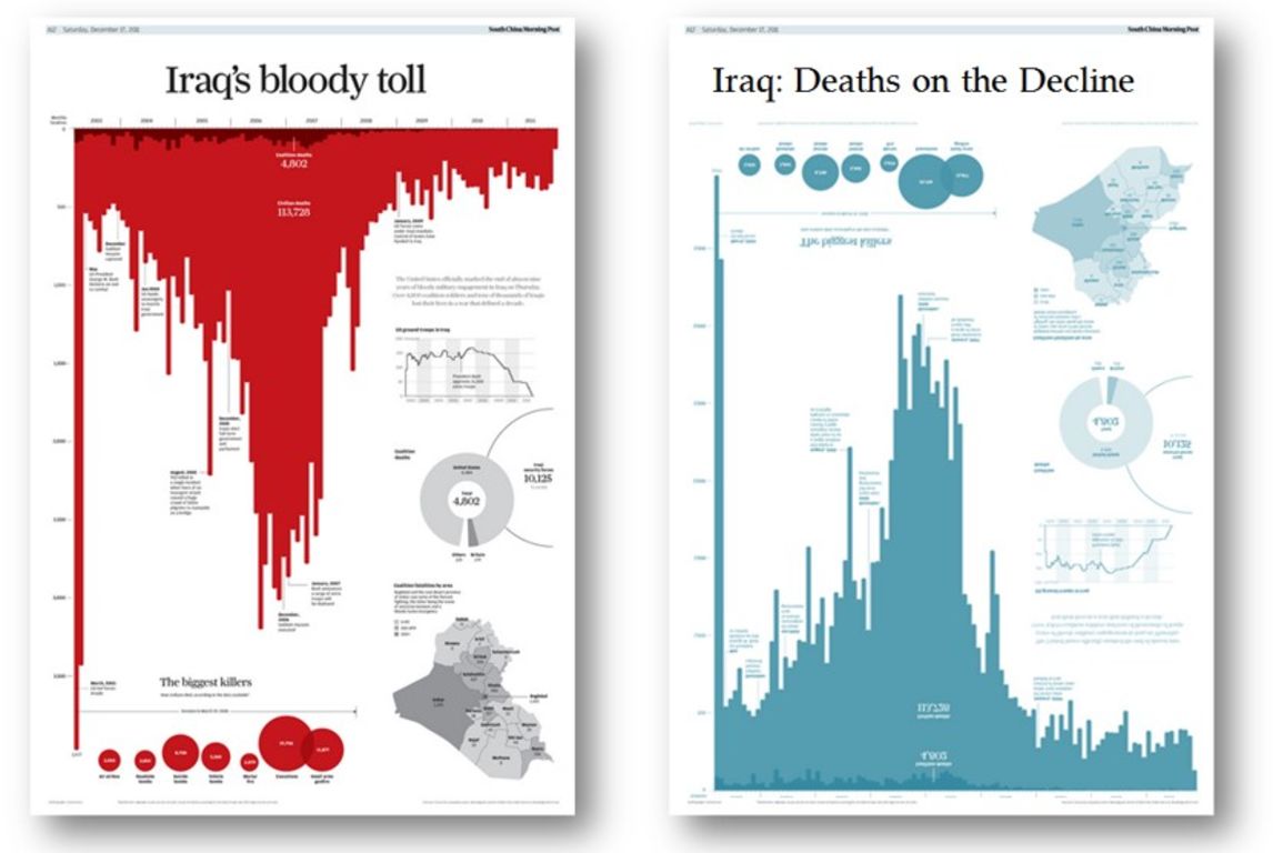
Did you notice they are made of the same data? The subject area is not all that positive; it shows the number of deaths in Iraq. But the visualization is a good example nevertheless. If you look at the left picture, you will see that the location of the diagram, graphics and red color causes the emotions much more than the second image.
The color red is automatically associated with blood, which gives a striking visual effect.
The right visualization is quite neutral with its blue color. Also, if you look at the title and the line of reduction in the graph, you can see a more positive image.
It is these simple techniques, that shows how we can tell the different stores using the same data, just changing the title, color and location to bring a completely different emotion to the reader.
Eye Tracking
What do people pay attention to when they first see a visualization? The Tableau Research and Design team took this data viz and conducted some real-time research with the conference attendees at Tableau Conference 2016. And they analyzed what people paid attention to and what numbers or elements they noticed.
For example, take a look at this picture.
![]()
![]()
Do you remember what you looked at? In this case, we see that the focus of the audience was on large numbers. It is essential to understand that these numbers not only provide some information but also are located at the top of the page. As soon as the arrangement of numbers changes, the focus changes too.
![]()
![]()
![]()
![]()
In this way, if we want to attract users and convey some information through the visualization, we should highlight some essential points. This is especially true for:
- Big numbers
- Medium or Large font
- The focus — top left corner
How to choose the right data visualization tool?
If you need to present your data to users, you’re likely to set of requirements to present charts, graphs, dashboards, or other data visualization. At this stage you need to choose the right data visualization tools for your apps.
Most likely, everyone knows the research company Gartner, which annually analyzes companies and publishes statistics.
The 2019 Gartner Magic Quadrant for Analytics and Business Intelligence Platforms report evaluated 17 vendors and placed them in 4 quadrants, based on completeness of vision and ability to execute. It includes:
- A uniform set of evaluation criteria
- A neutral analysis of how each vendor aligns to Gartner’s criteria on vision and execution
- A quick visual take of the BI landscape
BI report provides insights into major technology and business trends that will help stay ahead and make smarter decisions for organizations.
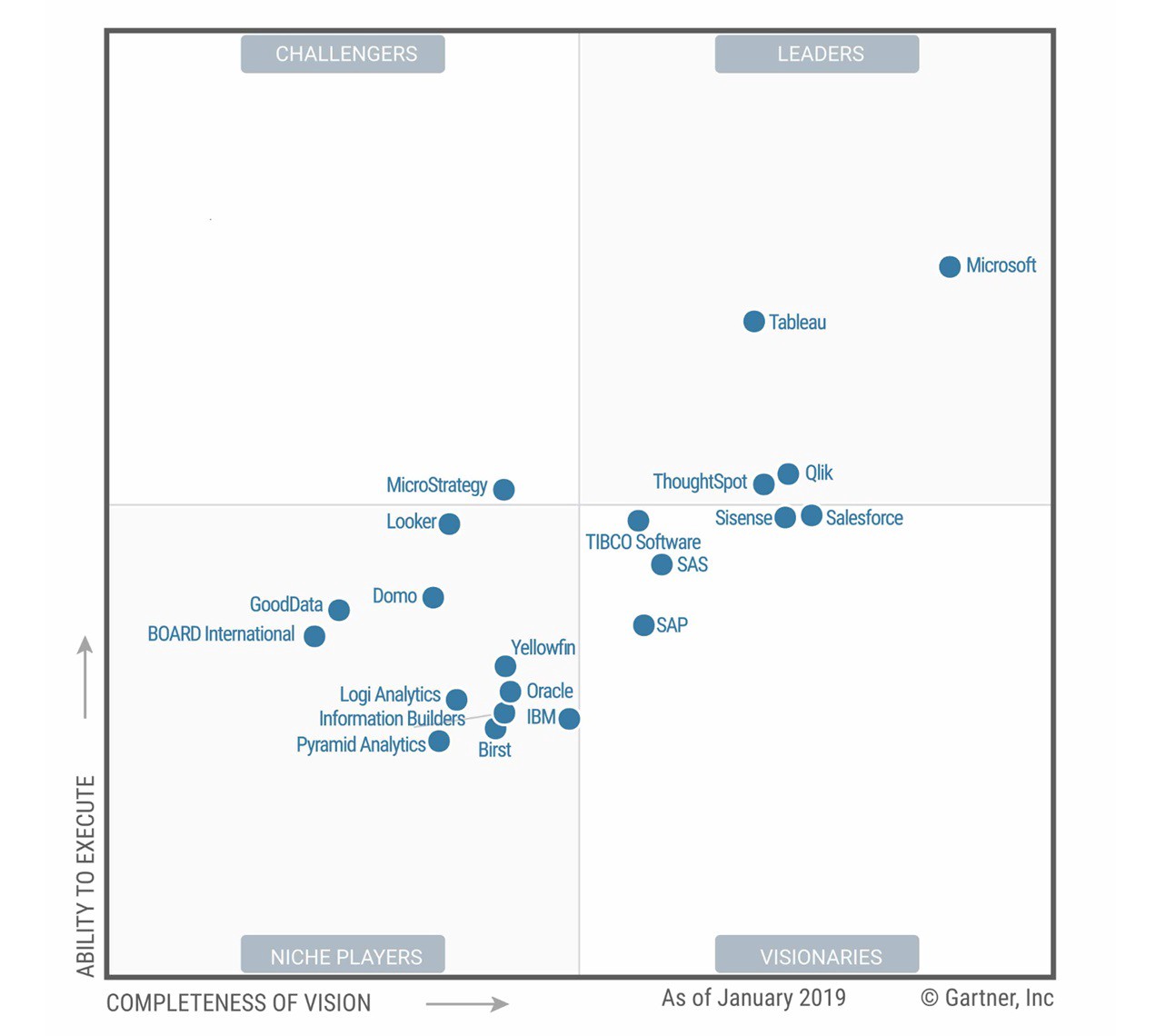
In this case, three main companies have been the leaders for the past three years: Microsoft, Qlik, and Tableau.
If speaking about Tableau, 2019 is the seventh year of the company as the leader of the Gartner Magic Quadrant. It offers several deployments and licensing models that target numerous industries and price categories.
In our next story we will show the advantages and disadvantages of using Tableau. So, if you wish to be informed about the latest GreenM’s news, follow us.
WANT TO REDUCE DATA INVESTIGATION TIME?
Learn about our Tableau-based product that helps you find the information you need across a loads of metrics and visualizations.