How to optimize a supply chain with interactive data visualization?
Interactive data visualization refers to the use of graphical representations of data in an interactive format, which allows you to explore data dynamically, drill down into details, and customize views based on your specific needs. In supply chain management, it can help you optimize your workflow, automate processes, enhance customer experience, gain deeper insights, and make real-time decisions.
Some interesting figures: According to Deloitte, 79 percent of businesses with superior supply chain capabilities achieve revenue growth that is significantly above average, 69 percent of supply chain leaders have an EBIT margin that is significantly above average, 75 percent of leaders utilize optimization software, and 67 percent use visualization software.

A solution related to supply chain optimization with the help of interactive data visualization suggests itself. In this article, you’ll learn our data visualization practices for optimizing your supply chain.
How can you optimize the supply chain through interactive data visualization?
Supply chain visualization is about resolving urgent issues in practice, including, but not limited to:
- aggregating data from diverse sources,
- having all data processed,
- identifying bottlenecks and inefficiencies,
- better planning, etc.
Let’s see how interactive data visualization can go through the challenges that arise in supply chain management with a hierarchy breakdown.
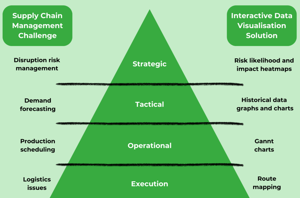
Strategic Management:
- Challenge: a risk of disruptions in the supply chain as the main challenge, which might be in the form of natural disasters, supplier or transportation issues, geopolitical events, market demand, pricing fluctuations, regulatory compliance, etc.
- Solution: in this case, you can utilize risk heatmaps to represent the likelihood and impact of various risks, their prioritization, scenario analysis, mitigation planning, communication, and real-time monitoring.
Tactical Management:
- Challenge: need for demand forecasting to understand unpredictable market dynamics, patterns, dependencies, and consumer preferences.
- Solution: for starters, it will be good to utilize interactive charts and graphs to visually analyze historical data. Time-series visualizations can highlight trends, seasonality, and fluctuations in demand, providing a foundation for more accurate forecasting.
Operational Management:
- Challenge: optimizing production schedules to meet demand while minimizing downtime and production costs.
- Solution: it would be appropriate to implement interactive Gantt charts for production scheduling, enabling real-time adjustments, and visualize the entire production process, including the sequence of tasks.
Execution Management:
- Challenge: identifying inefficiencies, visualizing dependencies, and optimizing the logistics network for improved efficiency, inventory tracking, and delay prevention.
- Solution: integrating interactive maps for route optimization, considering factors like traffic, weather, and delivery windows, and for shipment monitoring will work for you.
To pull this off, it is required to have an appropriate tool, unless you have any. So, it is time to move on to the next important thing.
Searching for your best supply chain management software
Having the right data visualization and chain management tool is crucial for the efficient and effective management and optimization of your supply chain operations. The search process involves evaluating key factors to ensure the chosen tool aligns with your business needs and goals, which include integration capabilities, data visualization features, user-friendly interface, scalability, cloud-based option, etc.
We have prepared for you a tool selection with a perfect combination of capabilities and features to do simple and intuitive visualizations, which is especially helpful for supply chain management purposes. So, if you are still looking for a valuable tool, you can consider the following supply chain data visualization tools:
- Tableau,
- Power BI included in the Dynamics 365 platform,
- Amazon QuickSight,
- Qlik, or
- D3 Charts.
If you already have your tool, you might think of optimizing its performance so that the reports and visualizations open and run quickly and smoothly. In case of any questions to that end, do not hesitate to ask them since we specialize in data integration, preparation, visualization, and tool performance optimization as part of our BI & analytics service.
Discover our BI & analytics service for streamlined tool optimization and visually stunning reports
Creating supply chain dashboards for comprehensive insights
Once the data visualization tool has been chosen, you can proceed with creating a user-friendly dashboard. This step will open the doors for you into the performance and dynamics of your supply chain. Correctly set dashboards provide a clear vision of key metrics, trends, and KPIs, which facilitates stakeholders to make informed decisions quickly.
Identifying key supply chain performance metrics
Before designing your customized dashboard, it is important to determine the most critical Key Performance Indicators (KPIs) for your supply chain to include in your visualization the following performance metrics: inventory turnover rate, order fulfilment metrics, production, delivery performance, supplier reliability, lead times, transportation values, customer service metrics, etc. Then, you are supposed to define the objectives and goals you aim to achieve with your dashboard.
Enhancing supply chain visibility with visualizations
The next move shall be preparing, cleaning data, and integrating relevant data sources into the dashboard for further visualization. Once done, you are ready to design a visualization that illustrates any detail in your workflow, in particular, the flow of goods from procurement to production and distribution.
You can use flowcharts, trend charts, process maps, or timelines, using colors, filters, and highlighting key information, so that each stage of your supply chain management becomes visible. It could be even interactive scorecards for supplier performance.

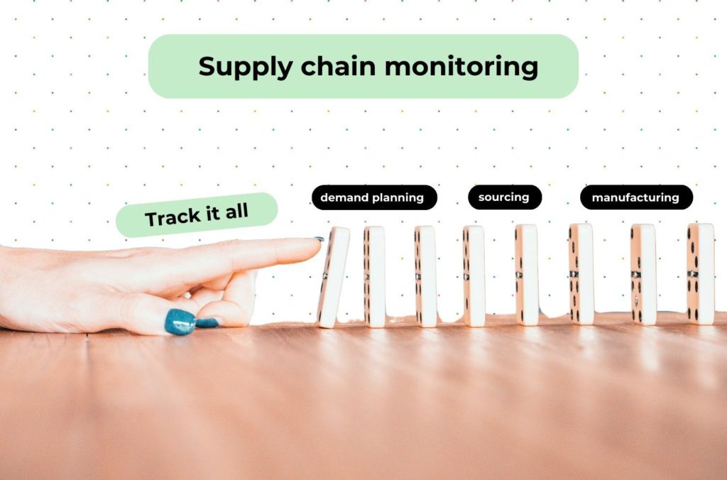
Supply chain monitoring: a window into performance
The ability to proactively identify and resolve issues is available thanks to supply chain monitoring. Interactive dashboards can point out potential bottlenecks, delays, or inefficiencies, allowing supply chain managers to take corrective actions before problems escalate.
End-to-end supply chain process visualization gives a holistic view, eliminating the lack of workflow visibility, and ensuring that every stage of the supply chain is transparent and accessible. Moreover, supply chain monitoring ensures that the data used for forecasting is up-to-date and reliable.
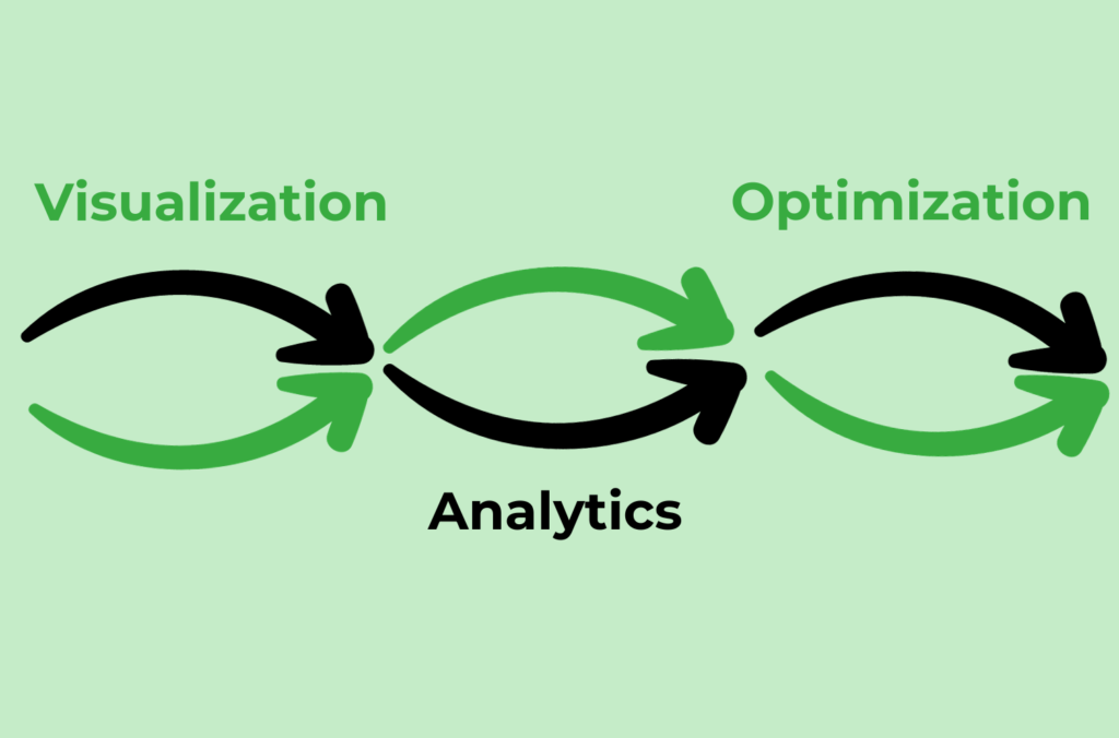
How can the supply chain analytics help you in the supply chain optimization?
The final step shall be diving into analytics and translating insights derived from interactive data visualizations into actionable strategies. With visual elements and analysis, you are going to find weak spots in your supply chain and gaps in the market. By harnessing the power of analytics, you will be able to make all links in your supply chain work as a single mechanism, turning it into informed decisions, strategic planning, and continuous improvement, facilitating better collaboration between supply chain participants.
Thus, supply chain analytics and visualization are an ideal mix to get the best from your supply chain data. You can also read more about how revenue can be gained through analytics in our previous article.
Conclusion: how interactive data visualization benefits the supply chain optimization
To sum up, it should be mentioned that supply chain optimization is a crucial aspect of any successful business. In today’s fast-paced and competitive market, companies need to constantly evaluate and improve their supply chain processes to stay ahead of the game. Interactive data visualization is a powerful tool that can greatly benefit supply chain optimization efforts. By utilizing data visualization techniques, you can easily:
- enhance customer satisfaction and brand loyalty by figuring out your audience needs and organizing an exceptional service,
- gain a competitive edge by streamlining processes and offering the most suitable products and services,
- reduce costs by pinpointing areas where costs can be trimmed without compromising efficiency, and eventually
- increase revenue through smart inventory, resource management, and sale breakthrough.

It’s just a fact that visual representations of data are often more easily comprehensible than raw data. Better coordination, synchronization of activities, and an efficient and responsive supply chain are more than achievable. Overcoming complexities in supply chain management, levelling up demand forecasting, avoiding disruptions in the supply chain, and driving long-term success are real with the right visualization type for data and analytics. You are always welcome to bring it to reality with us. See you soon!