8 best free data visualization tools and how to use them
Imagine an iceberg. Now, big data. At first glance, they may seem like disparate things, but upon closer examination, they share intriguing similarities. They both contain visible and invisible parts, possess layers of depth and complexity, and can even pose risks and uncertainties. To uncover what lies beneath their surfaces, it is required to delve into their depths.
In the case of big data, data visualization turns the invisible into the visible, transforming raw data into meaningful insights, actionable information, and refining raw data into dollars. In today’s data-rich world, the capability to effectively visualize data is a valuable asset across industries. Through data visualization, you can do almost everything to empower your business, for example:
- optimize a supply chain,
- improve patient care, or
- boost decision-making.
Some interesting figures: 72% of companies believe that data visualization helps make faster decisions. 62% of companies state that data visualization has significantly improved their sales and marketing strategies. 58% of businesses report reduced operational costs after implementing data visualization tools. 64% of companies believe data visualization has improved customer satisfaction rates. 53% of businesses report that data visualization has enhanced product development processes.
By the way, data visualization tips, data mapping, data analytics – all of these make it possible to get the most of big data. But today, we will discuss data visualization, or more precisely, free tools that can aid individuals and organizations in unlocking the potential of their data without breaking the bank.
Make the invisible visible with our data visualization and analytics services
8 best free data visualization tools in 2024
1. Candela: Candela is a free open-source data visualization library that provides a high-level grammar for creating visualizations in JavaScript. It simplifies complex visualization tasks and offers a concise and declarative syntax for building interactive visualizations.
Data input formats: Candela primarily works with structured data in JSON format. It supports various data structures, including arrays, objects, and nested data.
Advantages:
- Simplifies complex visualization tasks
- High-level grammar for creating visualizations
- Open-source and community-driven development
Key features:
- High-level grammar for specifying data, encoding channels, and mark types
- Support for various chart types, including bar charts, line charts, scatter plots, and more
- Interactive visualizations with customizable tooltips, legends, and interactions
- Responsive design for creating visualizations that adapt to different screen sizes
How-to:
- Install Candela via npm or include it as a script tag in your HTML.
- Import the necessary modules from Candela.
- Use Candela’s high-level grammar to create visualizations by specifying data, encoding channels, and mark types.
- Customize the appearance and behavior of the visualizations using Candela’s API and configuration options.
- Embed the visualizations in your web application or export them as images or SVGs.
2. D3.js: D3.js (Data-Driven Documents) is a powerful JavaScript library for creating dynamic, interactive visualizations on the web. It enables developers to build custom visualizations from scratch using HTML, SVG, CSS, and JavaScript.
Data input formats: D3.js works with various data formats, including JSON, CSV, TSV, and arrays. It provides methods for loading and parsing data from different sources.
Advantages:
- Comprehensive documentation and active community support
- Extensive range of chart types and customization options
- Dynamic, interactive visualizations
- Widely used and adopted in the industry
Key features:
- Data-binding and DOM manipulation methods for creating and updating visual elements
- Support for a wide range of chart types, including bar charts, line charts, scatter plots, and more
- Built-in transitions and animations for creating interactive visualizations
- Ability to work with large datasets and update visualizations in real-time
How-to:
- Include the D3.js library in your HTML document.
- Use D3.js’s data-binding and DOM manipulation methods to create and update visual elements based on data.
- Customize the appearance and behavior of the visualizations using D3.js’s API and configuration options.
- Handle user interactions such as mouse events and transitions to create interactive visualizations.
- Embed the visualizations in your web application or export them as images or SVGs.
3. Datawrapper: Datawrapper is a web-based tool for creating static and interactive charts, maps, and tables. It offers a user-friendly interface and pre-designed templates, making it suitable for non-technical users.
Data input formats: Datawrapper supports various data formats, including CSV, XLSX, and Google Sheets. It provides options for importing data from different sources and formats.
Advantages:
- User-friendly interface and intuitive workflow
- Pre-designed templates and customization options
- No coding required; suitable for non-technical users
- Embedding options for sharing visualizations on websites and social media
Key features:
- Drag-and-drop interface for creating visualizations
- Support for a wide range of chart types, including bar charts, line charts, pie charts, and more
- Customizable colors, labels, and formatting options
- Responsive design for creating visualizations that adapt to different screen sizes
How-to:
- Choose the type of visualization you want to create (e.g., bar chart, line chart, map).
- Upload your data or connect to a data source such as Google Sheets or Excel.
- Customize the appearance and behavior of the visualization using the editor tools and options.
- Preview and refine the visualization as needed, then publish or embed it on your website or share it via a link.
4. RAWGraphs: RAWGraphs is an open-source tool that enables users to create custom visualizations from raw data. It offers a simple interface and supports various chart types, making it suitable for users who want to create unique and visually striking visualizations.
Data input formats: RAWGraphs accepts data in CSV or TSV format. Users can upload their data directly into the tool or paste it into the editor.
Advantages:
- Open-source and customizable
- Support for a wide range of chart types and layouts
- Interactive preview and real-time updates
- Export options for saving visualizations in various formats
Key features:
- Simple interface for creating visualizations
- Support for various chart types, including scatter plots, bar charts, network diagrams, and more
- Interactive preview and real-time updates for exploring data
- Export options for saving visualizations as images or SVGs
How-to:
- Download the RAWGraphs application or use the online version.
- Upload your data in CSV or TSV format or paste it directly into the editor.
- Choose the type of visualization you want to create from the available options.
- Map your data columns to visualization attributes using the mapping interface.
- Customize the appearance and behavior of the visualization using the editor tools and options.
- Preview and refine the visualization as needed, then export it in your desired format.
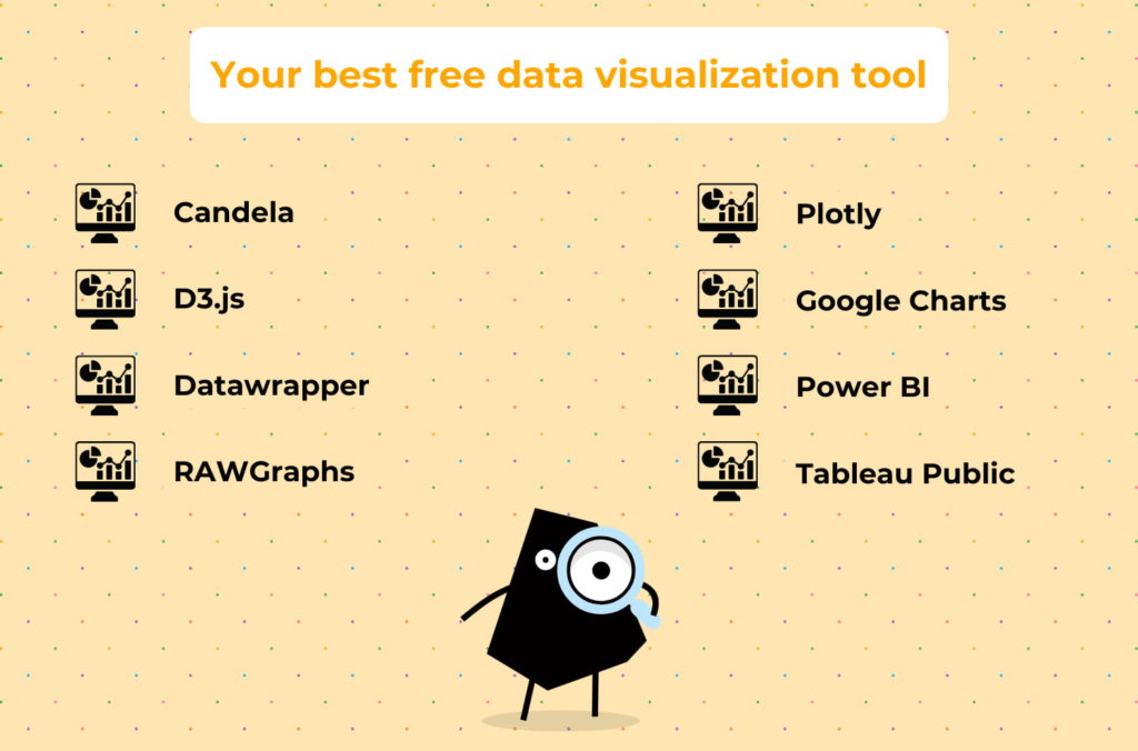
5. Plotly: Plotly is an open-source data visualization library that supports multiple programming languages, including Python, R, and JavaScript. It offers a wide range of chart types and customization options for creating interactive visualizations.
Data input formats: Plotly works with various data formats, including lists, arrays, data frames, and pandas DataFrames. It provides methods for importing and formatting data from different sources.
Advantages:
- Support for multiple programming languages
- Extensive range of chart types and customization options
- Interactive visualizations with hover effects, zooming, panning, and more
- Built-in sharing and collaboration features
Key features:
- Support for a wide range of chart types, including scatter plots, line charts, bar charts, pie charts, and more
- Customizable colors, labels, and formatting options
- Interactive visualizations with hover effects, zooming, panning, and more
- Built-in sharing and collaboration features for sharing visualizations with others
How-to:
- Install the Plotly library for your preferred programming language (e.g., Python, R).
- Import the necessary modules and initialize Plotly in your script.
- Create a Plotly figure object and specify the data and layout options for the visualization.
- Customize the appearance and behavior of the visualization using Plotly’s API and configuration options.
- Display the visualization in your preferred environment (e.g., Jupyter Notebook, web browser) or export it as an image or HTML file.
6. Google Charts: Google Charts is a free data visualization tool provided by Google that allows users to create a variety of charts and graphs for web applications. It offers a simple yet powerful API and supports various chart types, making it suitable for a wide range of use cases.
Data input formats: Google Charts accepts data in various formats, including arrays, data tables, and Google Sheets. It provides methods for loading and formatting data from different sources.
Advantages:
- Simple yet powerful API
- Support for various chart types, including line charts, bar charts, pie charts, and more
- Seamless integration with other Google products such as Google Sheets and Google Drive
- Ability to embed visualizations in websites and applications easily
Key features:
- User-friendly API for creating visualizations
- Support for interactive features such as tooltips, zooming, and panning
- Customizable colors, labels, and formatting options
- Integration with other Google products for data import and export
How-to:
- Include the Google Charts library in your HTML document.
- Load the necessary visualization modules and dependencies.
- Create a data table or load data from an external source such as Google Sheets.
- Initialize a chart object and specify the data and configuration options.
- Customize the appearance and behavior of the chart using the API methods and options.
- Embed the chart in your web application or website using the provided HTML snippet.
7. Power BI: Microsoft Power BI is a free desktop application for creating interactive reports and dashboards. It provides powerful data visualization capabilities and integrates with other Microsoft products such as Excel and Azure, making it a popular choice among business users and analysts.
Data input formats: Power BI supports various data formats, including Excel spreadsheets, CSV files, databases, and cloud services. It provides connectors and APIs for importing and integrating data from different sources.
Advantages:
- Integration with other Microsoft products such as Excel and Azure
- Powerful data visualization capabilities for creating interactive reports and dashboards
- Support for collaboration and sharing features for working with teams and stakeholders
- Scalable and customizable for enterprise-level deployments
Key features:
- Drag-and-drop interface for building interactive reports and dashboards
- Support for various chart types, including bar charts, line charts, pie charts, and more
- Data modeling and transformation capabilities for preparing and analyzing data
- Integration with other Microsoft products for data import, analysis, and visualization
How-to:
- Download and install the Power BI Desktop application on your computer.
- Import your data from various sources using the provided connectors and APIs.
- Create a new report and add data visualizations to the canvas using the drag-and-drop interface.
- Customize the appearance and behavior of the visualizations using the options and settings panel.
- Design interactive dashboards and reports by adding filters, slicers, and other interactive elements.
- Publish your report to the Power BI service or share it with others by exporting it as a file or embedding it in a web page.
8. Tableau Public: Tableau Public is a Tableau’s free data visualization software that allows users to create interactive visualizations and share them publicly. It offers powerful features for data analysis and visualization, making it suitable for individuals and organizations looking to visualize their data effectively.
Data input formats: Tableau Public supports various data formats, including Excel spreadsheets, CSV files, databases, and cloud services. It provides connectors and APIs for importing and integrating data from different sources.
Advantages:
- Powerful features for data analysis and visualization
- Support for interactive dashboards and reports
- Integration with other Tableau products and services
- Ability to share visualizations publicly and embed them in websites and applications
Key features:
- Drag-and-drop interface for building interactive visualizations
- Support for various chart types, including bar charts, line charts, scatter plots, and more
- Data blending and transformation capabilities for preparing and analyzing data
- Collaboration and sharing features for working with teams and stakeholders
How-to:
- Download and install Tableau Public on your computer.
- Import your data from various sources using the provided connectors and APIs.
- Create a new workbook and add sheets to the canvas for building visualizations.
- Drag and drop fields from your data onto the canvas to create visualizations.
- Customize the appearance and behavior of the visualizations using the formatting and options panel.
- Design interactive dashboards and stories by combining multiple visualizations and adding filters and actions.
- Publish your workbook to the Tableau Public server or share it with others by exporting it as a file or embedding it in a web page.
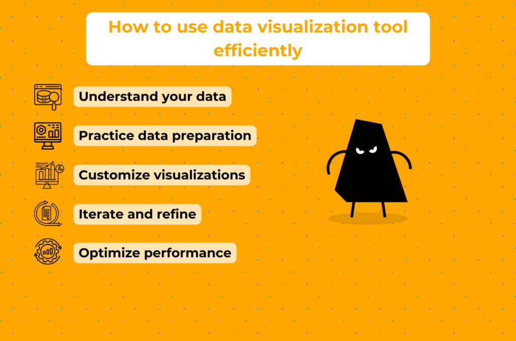
How to use open-source data visualization tools efficiently?
With free open-source data visualization tools, you can visualize literally any data. For instance, you can visualize IoT data, customer-related data, supply chain data, healthcare data, e-commerce data, real estate data, and so on. However, to do it in the most effective way, you are supposed to go the extra mile from successful data integration to tool performance optimization, including:
- Understand your data: Before diving into visualization, ensure you have a clear understanding of your data. Know the structure, format, and relationships within your dataset. This understanding will guide your visualization choices and help you effectively communicate insights.
- Practice data preparation: Clean, preprocess, and transform your data before visualizing it. Use tools like pandas in Python or dplyr in R to manipulate and prepare your data for visualization. Ensure that your data is in a format that is compatible with the open-source visualization tool you’re using.
- Customize visualizations: Take advantage of the customization options offered by the open-source visualization tool to tailor your visualizations and dashboards to your specific needs. Experiment with colors, fonts, labels, and annotations to enhance clarity and aesthetics.
- Iterate and refine: Visualize your data iteratively, refining your visualizations based on feedback and insights gained from exploration. Experiment with different visualization techniques, layouts, and storytelling approaches to find the most effective way to communicate your findings.
- Optimize performance: Pay attention to performance considerations, especially when working with large datasets or complex visualizations. Optimize your code, use appropriate data structures, and leverage caching and precomputation techniques to improve rendering speed and responsiveness.
Conclusion: give it a shot using data visualization tools for free
That’s all for now. You are equipped enough to make your business stronger with:
- these free data visualization tools,
- free BI tools,
- data mapping tools,
- ad fraud prevention tools, and
- customer complaint management tools.
If something is unclear to you to that end, ask us, we know the answers.